Brochure site vs booking site: a back-to-school 2026 audit
A brochure site presents you. A converting site books meetings. Back-to-school 2026 audit: 12 checks, Cal.com, and when you actually need to rebuild now.
Brochure site vs booking site: a back-to-school 2026 audit
A pretty site that books zero meetings is not an asset. It is a paid brochure.
Back-to-school 2026 is when many founders reopen their website, decide it “looks professional”, and wonder why the phone stays quiet. The answer is rarely the logo. It is the gap between a brochure site and a site that books meetings. The first tells people who you are. The second takes a visitor, in a few clicks, to a confirmed slot on your calendar.
France Num, the official digital-support programme for French SMEs, says it plainly: too many sites were built to present the company, not to attract clients. The public guide calls them “leaflet” sites. That is the same diagnosis we write in audits — except that for a coach, a small agency, a consultant or a services SME, the action that matters is not “send a message”. It is book a meeting.
This article is an operational audit. You will know where your site sits, which 12 points to fix first, which architecture (Next.js, Cal.com, n8n) holds in production, and when a tweak is enough versus a rebuild. At the end you can book 30 minutes: we open your URL together.
A brochure site shows. It does not close.
A brochure site does the job of an enlarged business card. Home, about, services, maybe a blog, a contact page with a five-field form. The tone is institutional: “We are passionate”, “A team that listens”, “Contact us”. Nothing is false. Nothing helps the visitor decide when and how to speak to a human either.
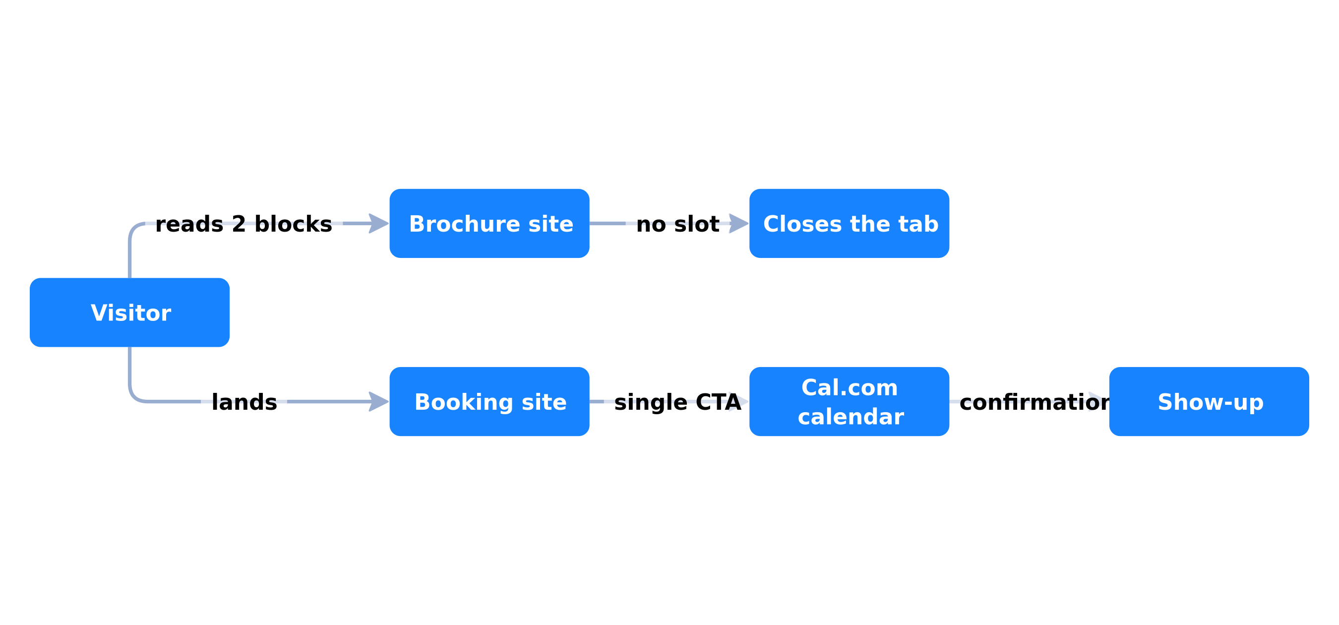
The typical brochure journey, from the prospect’s side, looks like this. They arrive from Google, LinkedIn or a QR code. They read two blocks. They look for a price: there is none. They look for a slot: there is none. They scroll to the footer, find an email, hesitate, close the tab. You have no trace of that visit except a pageview in Analytics.
This is not an “insufficient traffic” problem. It is friction after the click. France Num insists on the same point: if the answer to “what should the visitor do now?” is fuzzy, the site lacks calls to action. A “Contact us” button in the footer is not a call to action. It is a wish.
Five signs you have a brochure, not a commercial tool
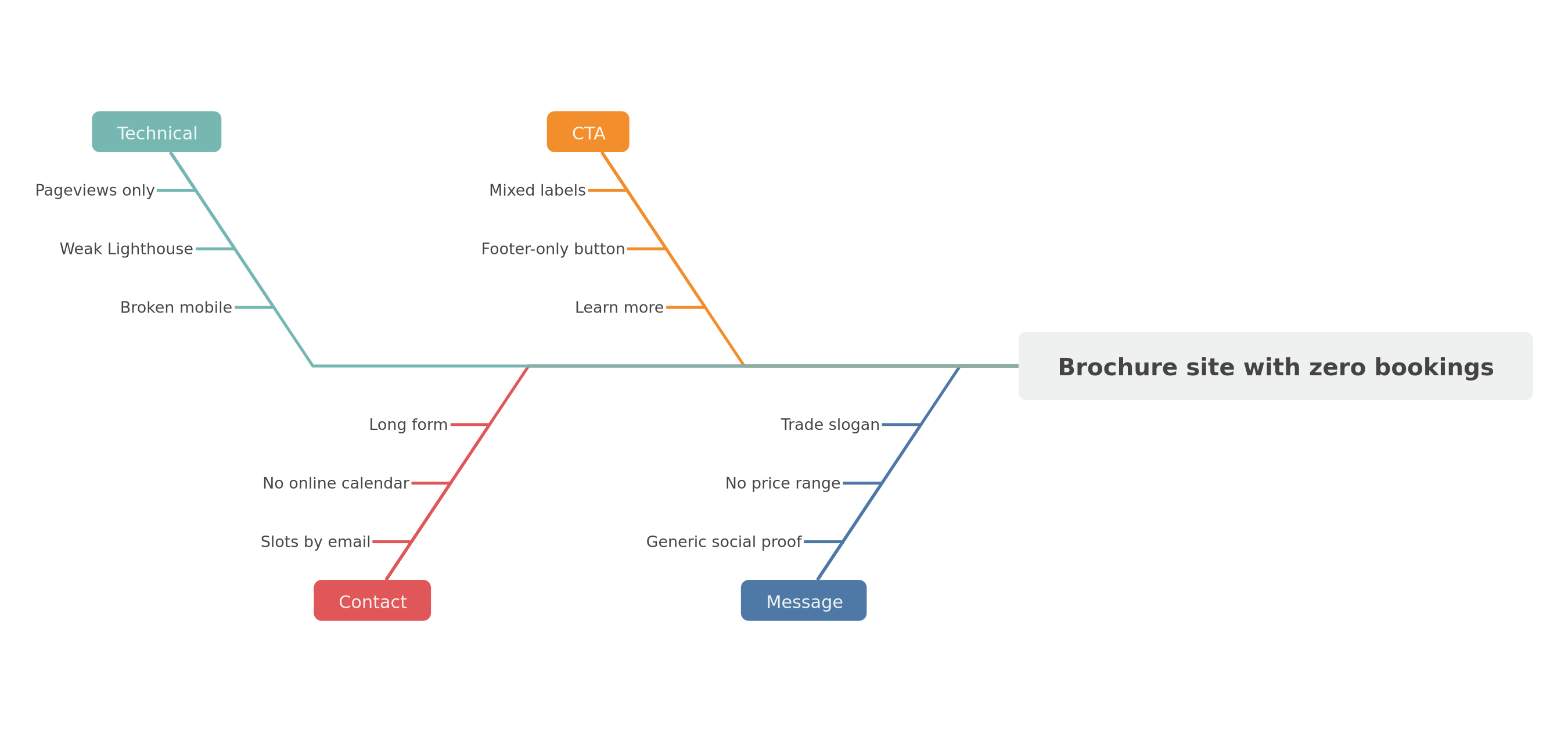
- There is no single CTA. Every page mixes “learn more”, “our team”, “our work”. The visitor chooses to choose nothing.
- Contact is a long form. Name, company, phone, budget, free-text message. Every extra field raises abandonment — a finding documented for years in form UX research (Baymard Institute checkout studies, transferable to B2B leads).
- No calendar is wired. You negotiate slots by email. Time from intent to meeting is measured in days.
- Proof is missing or off-context. Logos with no result, nameless quotes, “100+ clients” with no date.
- Nothing is measured as a conversion. GA4 counts sessions. Search Console counts impressions. Nobody counts meetings that actually happen.
A brochure site is not “bad”. It is unfinished. It stops at the moment money could come in.
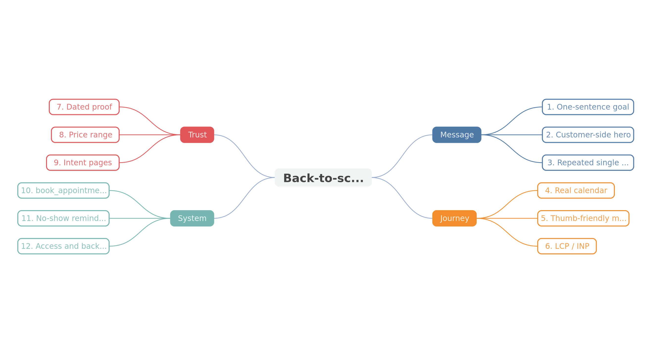
Brochure-site leaks stack: message, CTA, form, tracking, mobile.
A booking site has one job: lock the slot
A site that converts, for a services SME, is not necessarily e-commerce. It does not need a checkout. It needs a clear contract with the visitor: “Here is the problem we treat, here is who it is for, here is what happens when you click, here is a slot.”
Cal.com (the one we use), Calendly, or a custom calendar: the tool matters less than the rule. The visitor must not write an essay. They must see real availability, pick a time, get a confirmation, and you must receive context (source page, offer clicked, company size if you asked).
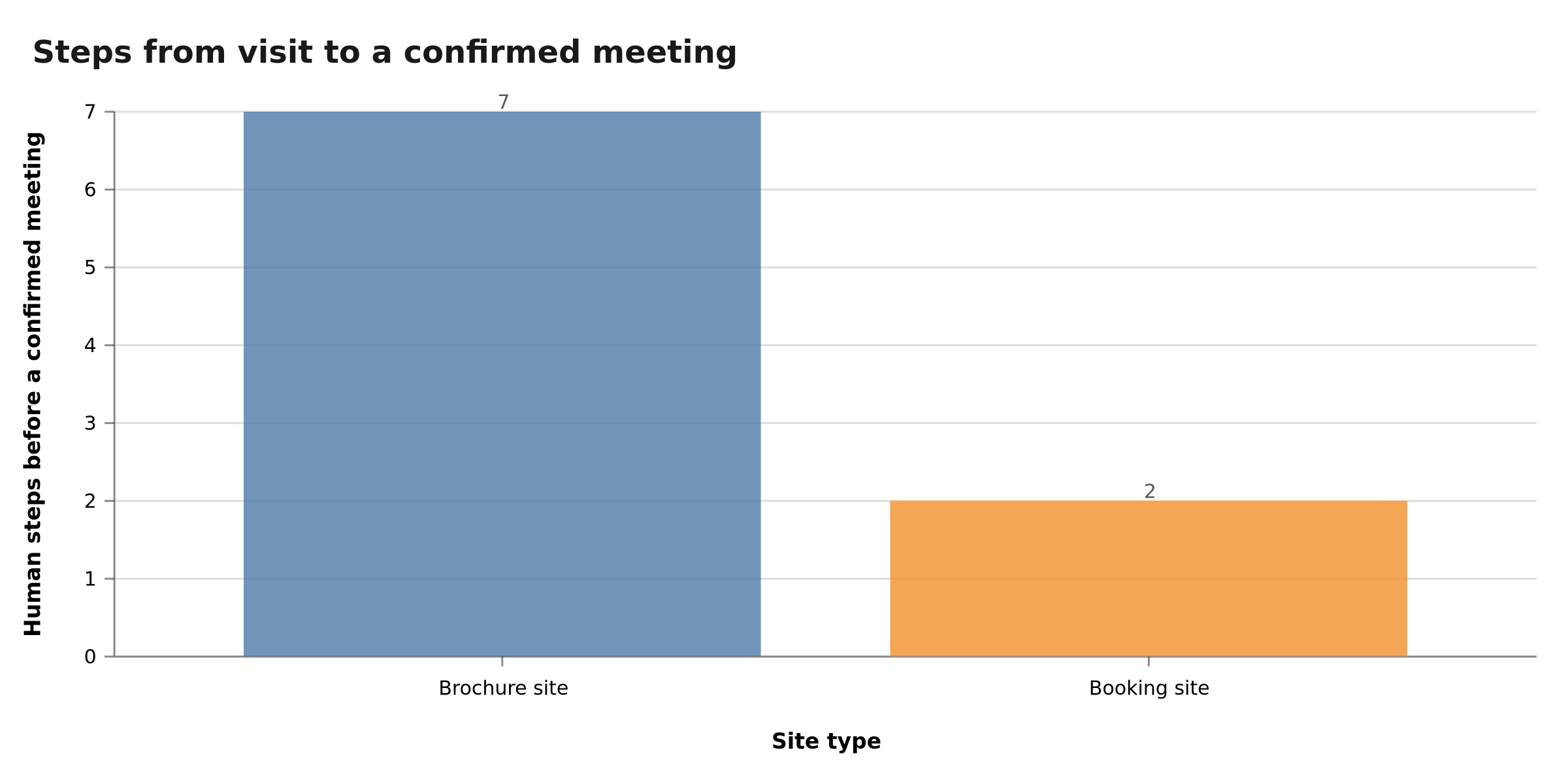
The difference is the number of human steps. On a classic brochure, you often count six to eight round-trips before a call: email, reply, three proposed dates, confirmation, reminder, video link. On a booking site you drop to one or two steps: click, slot, maybe a short qualification form.
Fewer human steps, more show-ups: the site must lock the slot, not open an email queue.
What the visitor must be able to do in under 60 seconds
- Understand the offer in one sentence, without jargon.
- See who this is not for (filters the curious).
- Read dated proof (project, result, constraint).
- Click the same CTA in the header, hero, mid-page and end of page.
- Land on a calendar that works on mobile, without creating an account.
If any of those five actions breaks, you do not have a booking site. You have a brochure with a button.
On the left the visitor bounces. On the right the slot is confirmed while intent is still hot.
Table: 12 criteria to classify your site
This is not a design contest. It is an audit grid. Tick out loud, homepage open.
| Criterion | Brochure site | Booking site |
|---|---|---|
| Homepage goal | Present the company | Get a slot (or a scoped quote) |
| Primary CTA | “Contact us” / “Learn more” | “Book 30 min” / “Pick a slot” |
| CTA placement | Footer, sometimes hero | Sticky header + hero + end of each offer |
| Form | 5–8 fields, free text | 0 fields if calendar; else 2–3 max |
| Proof | Missing or generic | Specific, dated, tied to the offer |
| Price or range | Never | Range or “from” |
| Mobile | Readable, tiny buttons | Thumb CTA, one-handed calendar |
| Speed (Lighthouse / CrUX) | Not measured | LCP and INP watched, images under control |
| Tracking | Pageviews | book_appointment event (or equivalent) |
| After the click | Email in an inbox | Confirmation + reminder + no-show handled |
| SEO | “Who we are” pages | Commercial-intent pages + FAQ |
| Maintenance | Frozen theme, random plugins | Documented stack, patches, backups |
A site can be “both”: a credibility base (a useful brochure) plus a booking journey. That is the combo most competing “brochure vs landing page” articles recommend. The angle they miss is that the landing page is not the goal. The calendar is. A landing without a slot is just a shorter brochure.
On the French SERP for “site vitrine vs site qui convertit”, the top results we analysed in August 2026 sit between roughly 300 and 2,000 words. Most compare a multi-page brochure to a one-page landing. Almost none treat booking a meeting as the conversion. That is the gap this audit fills: not another format war, a commercial object (the slot) and a 12-point checklist you can run tonight.
The same pattern shows up in English-language CRO posts: they talk heatmaps, A/B tests and “double your leads”. Useful — if you already have a CTA that means something. For a Qualiopi coach, a 10-person marketing agency, an independent consultant or a construction SME, the lead is not a newsletter subscriber. It is a 30-minute call that did or did not happen.
Is your site a brochure or a calendar? In 30 minutes we open the URL, tick this table, and tell you whether a tweak is enough. Book the site audit
The back-to-school 2026 audit: 12 points, in order
We do not start with “redo the logo”. We start with what blocks the meeting. The order below is the one we follow in audits. It crosses three layers any serious 2026 web audit should cover: technical, visibility, commercial message.
1. The goal fits in one sentence
Write: “When a visitor arrives, I want them to do X.” If X is not “book a call” or “request a quote with a slot”, you are steering something else (brand, hiring, press). That is allowed. It is a different brief.
2. The hero states the client’s problem, not your trade
“Innovative digital agency” is a label. “We automate quote follow-ups so your team stops copy-pasting emails” is an offer. The visitor recognises themselves in the second, not the first.
3. One CTA, repeated
Same wording everywhere. Not “Discover”, “Learn more” and “Let’s talk” at once. The label describes what the person gets: a 30-minute slot, an audit, a scoping call. Not a mystery.
4. The calendar is real, not a dead link
Test from a phone. Timezone, durations, qualification questions, confirmation email. If Cal.com (or the equivalent) opens a 404, or demands a Google account the visitor does not have, you recreated friction.
5. Mobile is not a shrunk desktop
In France a majority of consumer web traffic already comes from phones — check your GA4 report, not a global average. Tiny buttons, a clipped calendar, a sticky header hiding the CTA: those are leaks you can watch in Clarity (free replays).
6. Speed is no longer a bonus
Google PageSpeed Insights and Lighthouse measure LCP, INP and CLS. A WordPress brochure loaded with sliders and fonts can fail those metrics without the founder knowing. Next.js is not magic either: a misconfigured AVIF image pipeline even needed security patches in August 2026 (15.5.24 / 16.3.3). Performance and security travel together.
7. Proof sits next to the offer, not in the footer
A “very professional” quote under the logo reassures nobody. A line like “Quote follow-ups shipped in 3 weeks for a 12-person firm — August 2026” speaks to the next prospect.
8. Price is not a state secret
You do not have to publish a single tariff. A range, a “from”, a link to a pricing guide cuts anxiety. Visitors who want a €400 site will leave immediately. Visitors with budget will stay.
9. SEO serves intent, not ego
“Our story” pages convert poorly. “Pricing”, “timeline”, “for Qualiopi coaches”, “for construction SMEs” convert better because they match a query. Interlink them. Two internal links minimum per article: that is also our editorial rule.
10. Tracking names the conversion
In GA4, create a key event book_appointment (or the name you standardise). Without that event you optimise vanities: traffic, time on page, bounce rate. A booking site is judged on confirmed slots, then on show-up rate.
11. After the meeting exists
24-hour reminder, video link, internal brief. A no-show is not always “the prospect was not serious”. It is often a forgotten calendar. We ship those reminders with n8n / Make for clients; the principle is the same if you start by hand.
12. Someone owns the site
Domain in your name. Hosting access in your name. Recoverable code or exports. A one-page note: stack, DNS, where the calendar lives. A “turnkey” brochure without those keys is a window you do not own.
The audit starts with the goal and the CTA, not the logo. Technique comes next, to hold the meeting.
Below 100 conversions per variant per month, do not run a “scientific” A/B test. Several 2026 CRO guides repeat this: volume cannot conclude. Watch five Clarity replays. Fix the obvious leak. Recount meetings two weeks later.
Typical architecture: Next.js + Cal.com + n8n
You do not need a lab. You need a reliable chain.
The site serves pages, SEO, proof. At BOVO Digital the default stack is Next.js — performance, controlled pages, no plugin zoo. WordPress remains viable for a simple brochure if you accept maintenance and updates. Our Next.js 16 production checklist spells out what “in production” means for an SME.
The calendar (Cal.com in our case) is the conversion object. It opens as an overlay or a dedicated page. It asks two or three questions max if you qualify (budget, type of need). It writes to Google Calendar / Outlook.
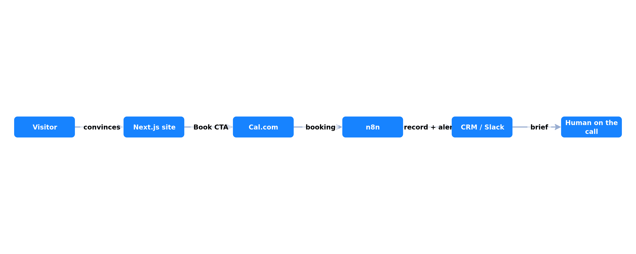
Automation (n8n) takes over after the booking: CRM row, Slack message, prep email, D-1 reminder. Without that layer you have a site that books meetings… that nobody prepares. Already better than a brochure. Not yet a system.
Two GDPR notes, because a calendar is personal data. First: you need a legal basis (usually pre-contractual steps or legitimate interest for B2B, depending on your counsel — we are not giving legal advice). Second: know where the processor hosts. Cal.com can be self-hosted; Calendly is a US SaaS. French public buyers and health-adjacent SMEs will ask. Document it before the first booking, not after a complaint.
If a Qualiopi trainer books discovery calls, the form should not ask for a life story. If a recruiting firm books candidate interviews, the reminder sequence is the product. If a construction SME books site visits, the SMS 24 hours before matters more than a parallax hero. Same architecture. Different questions on the Cal.com event.
The site convinces, Cal.com locks the slot, n8n prepares the human. Each brick has one job, not three.
The voluntary wall is here. Dropping a Calendly widget on a Divi theme is not hard. Holding production is: GDPR (legal basis, retention, US vs EU processors), double bookings, no-shows, qualification so aggressive it empties the calendar, tracking broken after an update. That is when DIY costs more than working with us.
If the issue is no longer the site but the lead queue after the click, the job slides toward n8n automation: follow-ups, CRM, reminders. The site stays the door. The workflow holds the rest.
What it costs to stay a brochure — and to switch
Staying a brochure is not free. It is opportunity cost. A founder who spends 4 hours a week proposing slots by email pays those hours even if they never invoice them. At €80/hour “internal” (an order of magnitude, not a loaded salary), 4 hours × 48 weeks is a little over €15,000 a year of friction. The figure is illustrative. Run it with your rate.
Switching has an investment cost. From the ranges we publish in the 2026 pricing guide (market estimates, not a BOVO rate card):
- Landing or scoped offer page: often a few hundred to €1,500.
- Professional brochure site: often €1,500 to €6,000.
- Custom Next.js site, booking journey, tracking: usually the top of the brochure range, up to several thousand euros depending on integrations.
The common mistake: paying for a “prettier” rebuild without changing the CTA. You then have a more expensive brochure. The 30-minute audit exists to avoid that.
Rebuild or optimise: the decision tree
Optimise if the pages exist, the message is roughly right, the stack is not a sieve, and you mostly lack the calendar, proof and tracking. Typical delay: days, not months.
Rebuild if the theme blocks a sticky CTA, mobile is unusable, WordPress is three versions behind, you do not have access, or every new page breaks SEO. Typical delay: weeks.
Wait (and measure) if you have almost no visitors. A booking site without traffic is an empty calendar. First work one intent page + one channel (local SEO, LinkedIn, a partnership). CRO without traffic is theatre.
We decide that on your URL, not in theory. 30-min audit, no commitment: tweak, rebuild, or “not now”. Book my slot
DIY checklist: 30 minutes before you call anyone
Do this tonight, site open on a phone.
- Write down the current CTA, word for word. If it does not exist, you have the diagnosis.
- Try to book a meeting as a stranger. Time it.
- Run PageSpeed Insights on the homepage, mobile.
- Check Search Console: is the homepage indexed?
- Install Clarity if it is missing. Watch one replay tomorrow morning.
- Count form fields. Above three, cut.
- Add a price range or a link to a pricing page.
- Write one offer sentence. Replace the slogan.
- Create the GA4
book_appointmentevent (even if it is 0 this week). - Decide: optimisation this week, or a call to scope a rebuild.
If you fail step 2 (impossible to book), do not spend on ads. You would pay to send people into a dead end.
This checklist is deliberately unglamorous. That is the point. Most brochure sites fail on steps 1–4, not on “brand storytelling”. Fix those four and you already have a site that can take meetings. The remaining six points keep the system from rotting after the first month.
Conclusion
A brochure site and a booking site can share the same visual world. They do not share the same contract with the visitor. The first informs. The second locks a slot while intent is hot.
Back-to-school 2026 does not require a “more modern” site. It requires a measurable journey: unique CTA, real calendar, proof glued to the offer, named tracking, automated follow-through. The 12 points above are enough to classify your URL. The diagrams give the order. Next.js + Cal.com + n8n is only a means — the right one, in our practice — to hold that journey in production.
If you run a small structure (coach, agency, consultant, services SME), the right test is not “is my site pretty?”. It is: can a stranger lock 30 minutes on my calendar tonight, from their phone? Everything else — colours, motion, slogan — is secondary while that answer is no.
Next action, not “think about it”: open your site on mobile, try to book, then take 30 minutes with us if the test fails. We will look at the 3 leaks, not your logo.
Tags
FAQ
What is the difference between a brochure site and a site that converts?
A brochure site presents the company (who you are, what you do, a contact form). A site that converts has one measurable action — for B2B services, that is almost always a booked meeting. The design can look identical. The journey cannot.
Do I need to rebuild my brochure site so it can book meetings?
Not always. If the stack is healthy (HTTPS, mobile, analytics, indexed pages) and the message is clear, you can wire Cal.com, shorten the form, and add proof in a few days. Rebuild when the theme is locked, Core Web Vitals are broken, or contact still takes five email round-trips.
How much does a site that books meetings cost in 2026?
For a services SME, a typical scope (Next.js site, a clear offer, Cal.com, follow-up, tracking) often sits between €2,000 and €8,000 excl. tax, depending on page count and CRM work. These are orders of magnitude, not a rate card. Full ranges live in our 2026 pricing guide.
Is a contact form enough instead of an online calendar?
A form creates a queue: the visitor writes, you read, you propose three slots, they reply. Each step loses people. An online calendar (Cal.com, Calendly, or equivalent) locks the slot while intent is hot. Keep the form for non-meeting cases (partnerships, press, support).
How do I know if my site actually converts?
In GA4, track one conversion event: `book_appointment` or equivalent, not just pageviews. Cross-check Search Console (queries) and, at low volume, Microsoft Clarity (replays). Below 100 conversions per variant per month, A/B tests are not reliable: qualitative observation is enough.
Does your site book meetings — or just present you?
We open your URL together, mark the 3 leaks, and tell you whether a fix is enough or a rebuild is required.
- 30 min
- No commitment
- Action plan

William Aklamavo
Web development and automation expert, passionate about technological innovation and digital entrepreneurship.